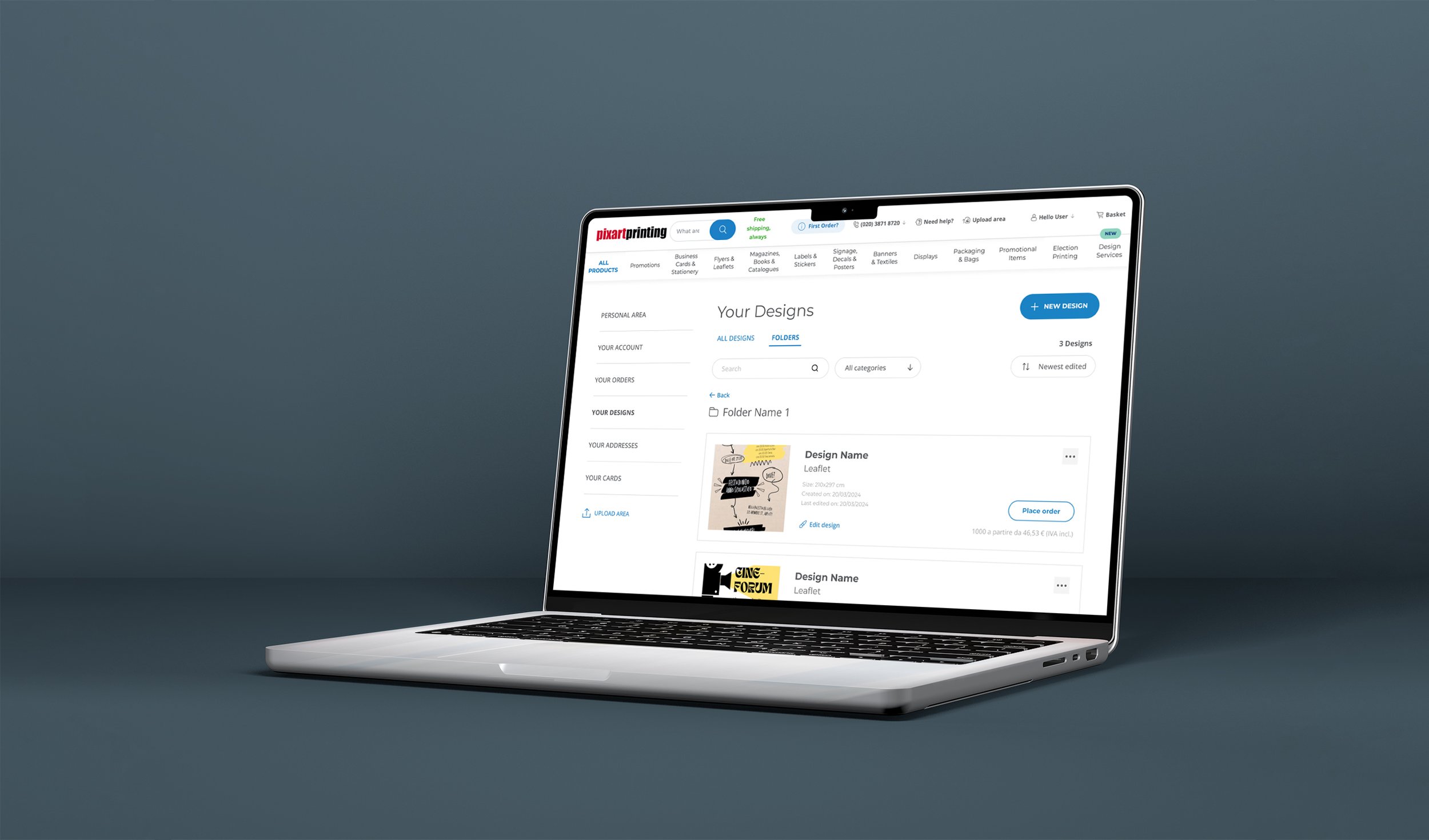
Project overview
The problem:
Pixartprinting has a huge flow of users who are constantly creating, uploading or editing new designs to print. At this time, there is no section dedicated to storing and managing all user-created designs.
The goal:
The objective is create a new section dedicated to managing all user designs. In this section the user should have the ability to create new designs based on the available options and to keep all of his or her work organized, thus being able to edit, delete, or duplicate it.
My role:
UX/UI designer
Researching user needs, designing wireframes, prototypes, and responsive interfaces and collaborating with developers for accurate design implementation.
Analysis & observations
I started by analyzing the user flow in purchasing a product on the Pixartprinting website and building a flow chart of the entire flow.
Observations
There are four ways to upload and create new files:
Upload your file: Where instructions are provided to upload a personal file, selecting this option will allow you to upload the file to the loading area once the order is completed. It will automatically check that the file features are correct.
Create your file now: Where you can create a file using the artwork creation tool.
Customise a design: Where you can choose from many templates as a starting point to create your own project.
Purchase a Design Service: Where you can request assistance from a graphic designer who can review your file or create one from scratch. Just explain your needs and load a reference.
Competitor analysis
Before starting to design the new section, I analyzed the competitors that provide the same service. Both direct and indirect competitors, that offers the functionality of organizing projects.
I created projects within their site and analyzed the management features.
Finally, I created a list of the interesting solutions used by each competitor and also what does not work well to avoid making the same mistakes.
Users Personas
To help me in the design process of the new feature, I came up with some users profiles that could take advantage of using this section to achieve its goals. This helped me to stay focused on the needs of users.
I think this feature is particularly useful for those who need to create and print new designs continuously for different events.
You will definitely need to keep order and have the ability to decline the design on different products. Surely the possibility to quickly reprint a project changing possibly some small details will be fundamental.
Keeping in mind all the observations made earlier I created a flowchart illustrating the feature flow.
In particular I have included the possibility of create new graphic files through various methods present on the website. I also included the possibility of organizing projects in folders and requesting graphic assistance.
Flowchart
Paper wireframes
I started the ideation phase by drawing by hand several drafts of wireframe and trying different solutions, marking the most functional ones.
Starting the design
Desktop design and prototype
I worked on this section keeping in mind the user’s needs and focusing on project management and organization.
So I included the option to search for a project by name or by category and added the possibility to sort the files by modification date or alphabetical order. The top right also shows the number of total projects.
To further increase organizational capacity, I added the ability to split projects by folders. So I added a dedicated section for their management.
There is also the possibility to create new projects by clicking on the button on the top right, it will open a pop up with the four choices of creating or loading new files.
I decided to create horizontal cards to better organize the contents of the projects. They will consist of a photo, name and main data, and a button to proceed with the order with an indication of basic price.
All file management features are inserted in a window that opens by clicking the three-dot icon on the right. You can also rename the file by clicking on the project name. Being the design change an important function I added a CTA below the main data.
Mobile design and prototype
Also for the mobile version I kept the same content organization and functionality.
I kept the button to create new designs in the upper right to ensure good visibility.
As for the desktop version, all the project management features are accompanied by an icon that increases its recognizability.
To optimize the spaces and ensure excellent visibility of the content I created windows that open from bottom to top occupying the width of the screen.
In general to realize the design of this new section I followed the guidelines provided (colors, fonts, buttons...) so as to ensure visual consistency within the site.
IMPACT
This new section helps users keep their work organized by saving them a lot of time and giving them the ability to create new products from designs they have already made so they maintain visual consistency and without having to start a new project each time.
Takeaways
WHAT I LEARNED
From this project, I learned how to manage complex sections containing different products and with different variables and functionalities while always keeping the user at the center of the design to ensure the simplest and most intuitive usability.


