FLYBY
Delivery Drones Company
Flyby is a shipping company that uses drones.
The typical users are between 16 to 50 years old, and most users are college students or small business owners. Flyby goal is to make shipments simple, safe and fast.
Project overview
The problem:
Shipping by drone is a new method and not many companies offer this service. The available services are difficult to use and with a poorly functional tracking service.
The goal:
Design a drones delivery website to be user-friendly by providing clear tracking and shipping flow.
My role:
UX/UI designer
Conducting interviews, paper and digital wireframing, low and high-fidelity prototyping, conducting usability studies, accounting for accessibility, and iterating on designs.
User research
I conducted interviews and created empathy maps to understand the users I’m designing for and their needs. A primary user group identified through research was working adults, students, and small business owners who seek fast and secure shipments with a clear tracking and shipping flow. Not many companies offer this service, and the few that exist are difficult to use and do not provide a functional tracking system, all of which make the service unsafe from the users' point of view.
Pain Points
1 - SHIPPING FLOW
Shipping flow design are often long and confused.
2 - TRACKING
The tracking system is often absent or inaccurate.
3 - RELIABILITY
The absence of functional monitoring makes the service unreliable.

Users Personas

User journey map
Mapping Alex user journey revealed how useful the tracking system is and how much it makes shipping more reliable.

Sitemap
My goal here was to create a simple and intuitive tracking and shipping flow to allow users to be able to use the service with extreme ease.

Paper wireframes
Next, I sketched out a paper wireframe for each screen of my website.
To guarantee the user optimal access to various devices, I worked on additional screen sizes to ensure the site was fully responsive.
Starting the design

Digital wireframe
screen size variation


Low-fidelity prototype
To create a low-fidelity prototype, I connected all the screens of the two main routes: tracking and creating a new shipment.
Usability study: findings
1 - CHANGE ADDRESS
Users want to be able to change the shipping address of an order placed
2 - LANDING
Users would like to be able to choose the exact point where to land the drone, this would make them more confident when ordering with the use of drones
3 - REMAINING TIME
Users want a clear estimate of the arrival time

Based on the insights from the usability study, I made changes to improve the site’s tracking flow.
I have implemented the possibility to change the address of an already placed order.
I implemented the possibility to choose where to land the drone

I added the timer to the tracking screen.


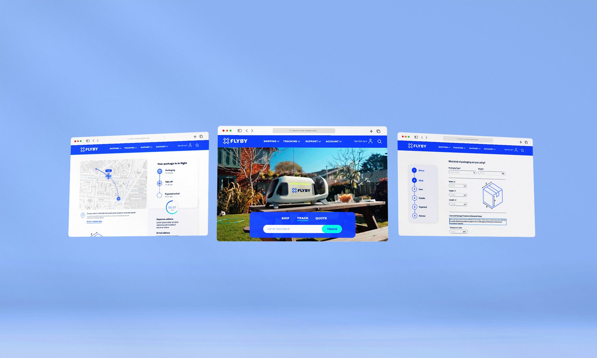
High-fidelity prototype
My hi-fi prototype followed the same user flow as the lo-fi prototype and included the design changes made after the usability study.

IMPACT
Our target users shared that the design was intuitive to navigate through, and it appears to be a reliable service.
Takeaways
WHAT I LEARNED
I learned that studying an easy-to-use interface makes the service more reliable from the users' point of view.
The most important takeaway for me is to always focus on the real needs of the user when coming up with design ideas and solutions.