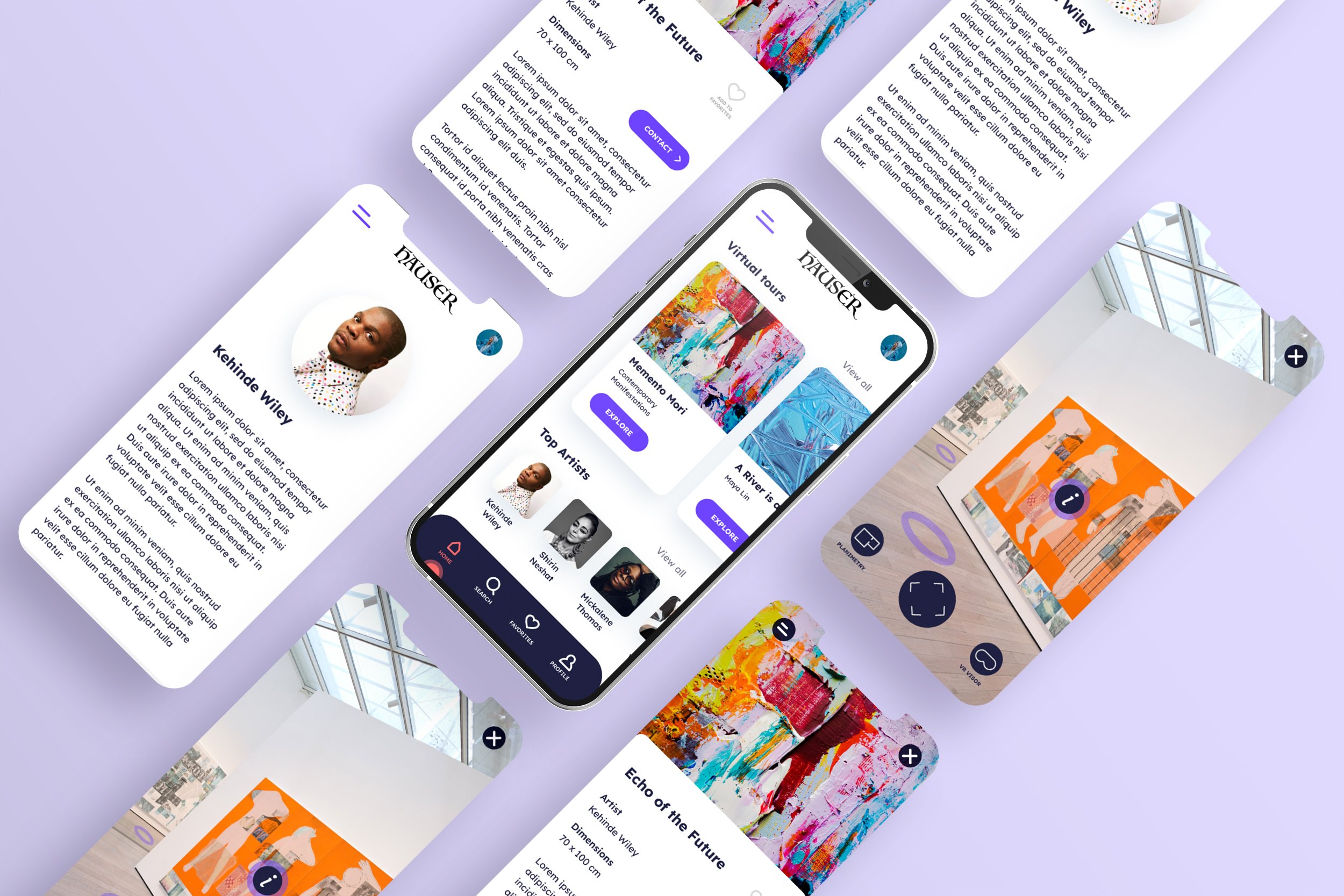
HAUSER
Virtual Tour App for an Art Gallery
Hauser is an art gallery located in Berlin. Specializes in the collection of contemporary art works by well-known and emerging artists. The gallery targets customers like worker or student who lack the time or the possibility to visit the gallery.
Project overview
The problem:
Worker and student lack the time or possibility to visit the gallery
The goal:
Design a virtual tour app can be a valid alternative to visit the gallery and save customers time.
My role:
UX/UI designer
Conducting interviews, paper and digital wireframing, low and high-fidelity prototyping, conducting usability studies, accounting for accessibility, and iterating on designs.
User research
I conducted interviews and created empathy maps to understand the users I’m designing for and their needs. A primary user group identified through research was working adults and students who don’t have time to visit an art gallery.
This user group confirmed initial assumptions about gallery customers, but research also revealed that time was not the only factor limiting users possibility to visit the gallery. Other user problems included obligations, distance or challenges that make it difficult to visit the gallery.
Pain Points
1 - TIME
Working adults are too busy to spend time
on visit the gallery
2 - DISTANCE
Many customers interested in visiting the art gallery may live far away and it may be impossible for them to visit the gallery
3 - ACCESSIBILITY
Some customers may not be able to visit the gallery on their own
Users Personas
User journey map
Mapping Ellen’s user journey revealed how useful it would be for users to have access at the gallery by an virtual tour app.
Paper wireframes
Taking the time to draft iterations of each screen of the app on paper ensured that the elements that made it to digital wireframes would be well-suited to address user pain points.
Starting the design
Digital wireframes
As the initial design phase continued, I made sure to base screen designs on feedback and findings from user research.
Low-fidelity prototype
Using the completed set of digital wireframes, I created a low-fidelity prototype. The primary user flow I connected was visiting a virtual tour, selecting an artwork and contatting the gallery so the prototype could be used in a usability study.
I conducted two rounds of usability studies. Findings from the first study helped guide the designs from wireframes to mockups. The second study used a high-fidelity prototype and revealed what aspects of the mockups needed refining.
Usability study: findings
Round 1 findings
Users need a more intuitive way to find the virtual tours in home page
Users need a clear info icon over the artworks
Round 2 findings
Users need a more visible button to start virtual tour
Users need the instructions before staring navigate inside the virtual tour
After the first usability study, I changed the name of the section to "virtual tours" and added a button on each tab to make the user flow more intuitive.
After the second usability study, I have implemented the possibility of following a tutorial for those who have never used the virtual tour before.
Takeaways
IMPACT
The app allows all users to visit the gallery from wherever they are
One quote from peer feedback:
“This app will save me a lot of time by letting me visit the gallery directly from home”
WHAT I LEARNED
I learned the importance of putting the user at the center of the design process. Understanding user needs, preferences, and pain points is crucial for creating a successful virtual tour app that meets their expectations.


